
2025 Award Winners
Architectural Honor Awards / Building
-
Stantec Architecture Inc.
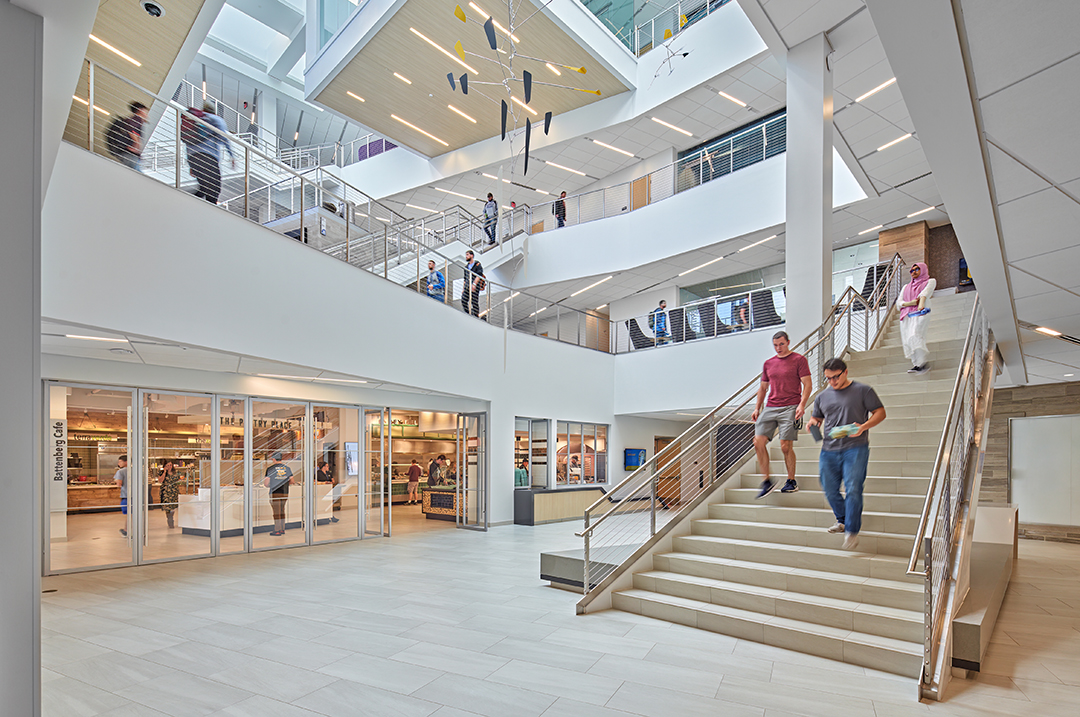
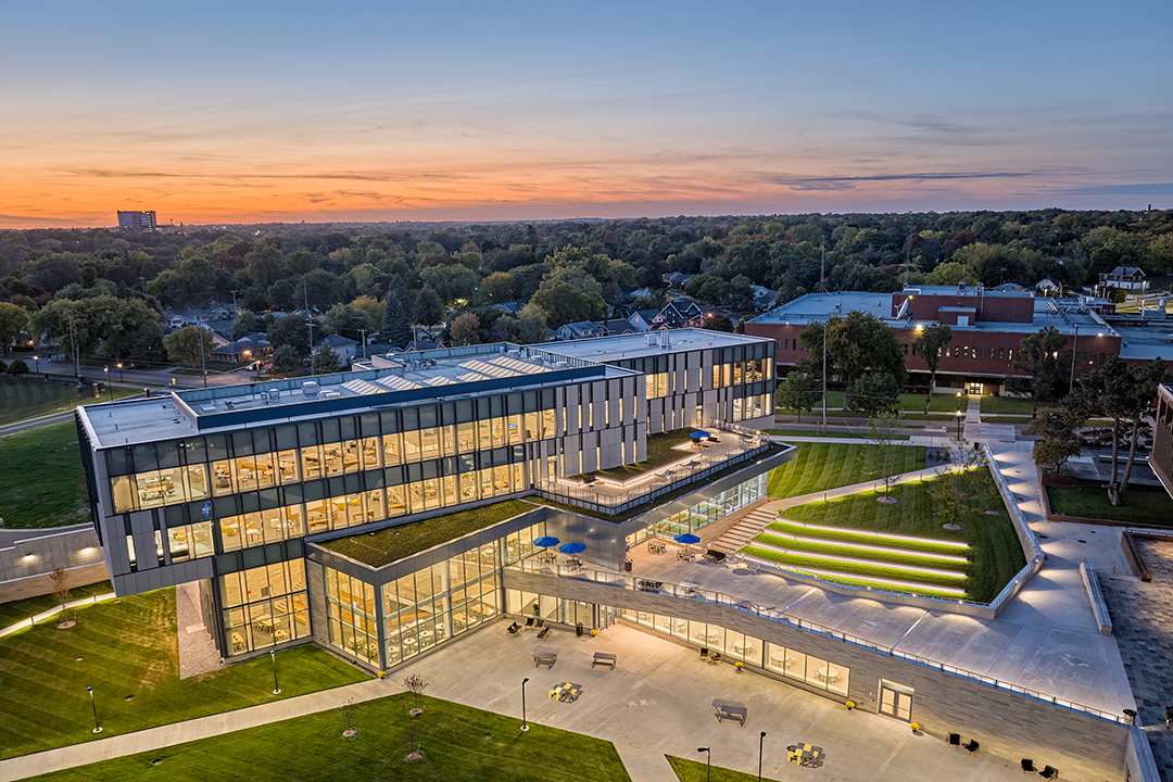
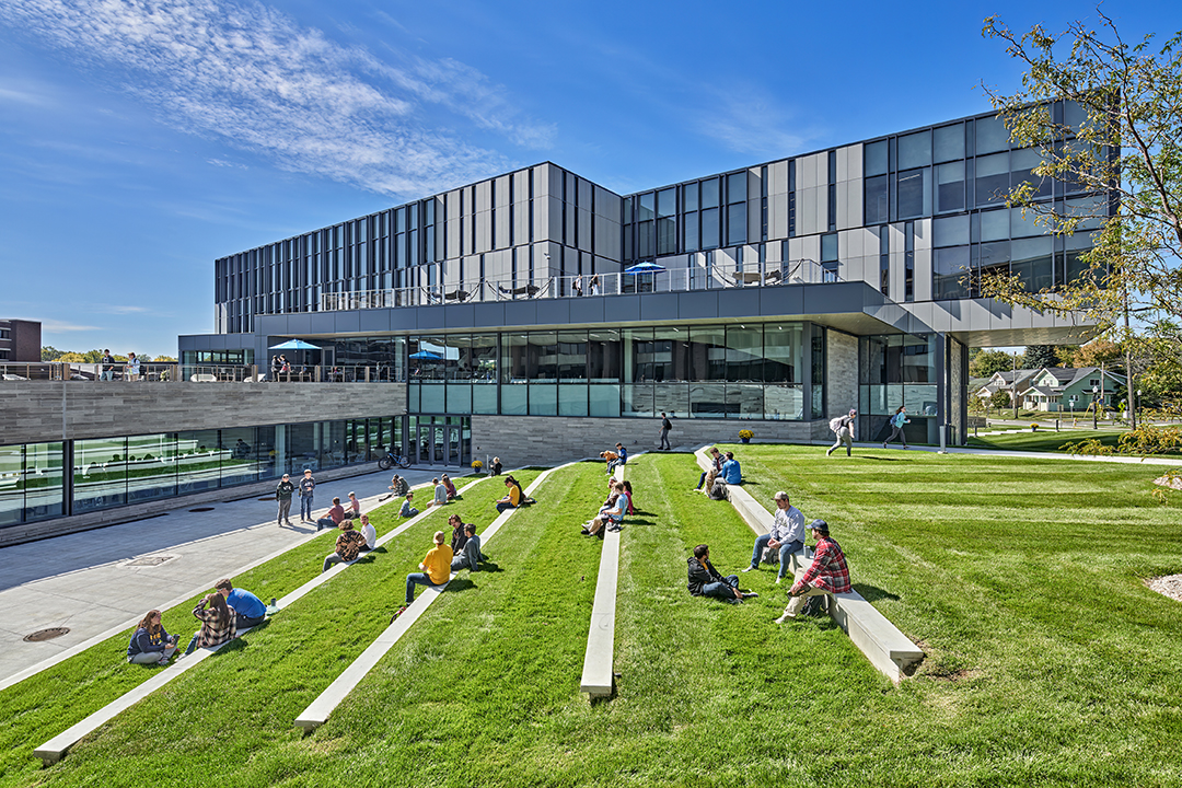
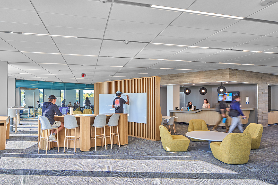
Kettering University Learning Commons
The new Kettering University Learning Commons in Flint, Michigan is a 24/7/365 hub, centralized to offer students a variety of spaces. From analog work environments to technology-rich presentation accommodations, it is an incubator for creativity. The Learning Commons was the catalyst of the 2014 Campus Master Plan and embodies an evolutionary leap for the institution, from a place known for preparing engineers, to an institution that is at the forefront of evolving engineering leadership in new STEM related technologies and industries.
Foregoing the conventional book stacks of an academic library, the new building complements the unique curriculum with a facility that is focused on innovation. With a year-round academic calendar where students alternate between on-campus studies and off-campus internships, the campus needed an environment that fosters work/life integration and opportunities to build the soft skills necessary in modern workplaces. These ideas are the foundation upon which the design was built.
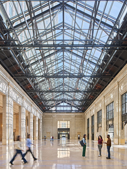
At 105,000 sf, the new four-story building features an atrium topped by a skylight filling the entire interior space with natural light and 360 degree views. The first and second floors feature gathering, dining and collaborative spaces, offering dynamic social spaces for students. The third and fourth floors consist of additional collaborative spaces and contemplative environments for research, student support, media resources, and group project work.
Design for Change:
Adaptable to evolving pedagogies and the need for rapidly changeable spaces, this digitally enabled environment supports students year-round. With its 100% “in-the-cloud” collections featuring over 900,000 e-books, 100,000 e-journals, and 100+ databases, it complements the curriculum with a place exclusively for project work and collaboration. It offers students a place to invite their co-op experiences onto campus while extending their academic experiences into their growing careers.
Infinitely reconfigurable, and rapidly adaptable, the Learning Commons interprets the needs of industry and its community into built form for higher education, marrying technology and craft, academics and social, education and industry together in a facility that makes a statement for where higher education must go in the future.
Design for Resources:
With its solid stone base and cement panel enclosure, emphasizing transparency through abundant curtainwall, the facility offers timeless elegance while allowing campus activities to hold the foreground. The interiors afford optimum flexibility. With power and technology woven throughout, the building can easily transform to meet untold academic needs while also affording easy adaptability to any future programs or space reconfigurations.
Materials have been selected to maximize natural and recycled content and indoor air quality while meeting the 75-year building lifespan for the facility with minimal maintenance requirements. Natural stone, metals, wood and glass feature prominently along with through-body cementitious, porcelain, and gypsum products to create a cohesive indoor to outdoor materials palette with minimal required finishes replacement/refurbishment.
Design for Energy:
The Learning Commons is a unique case for campuses with its 24/7/365 operations. This schedule demands heating, cooling, and electrical plants that can endure consistent operations with full redundancy for scheduled maintenance needs. All the primary mechanical and electrical equipment is located indoors to extend service life and allow easy maintenance for optimal performance.
KULC was designed to achieve LEED NC 4.1 Silver standards, though the university will not be registering or certifying. The green roofs reduce rainwater runoff and lower surface temperatures while reducing maintenance and extending the life of the roofing systems. Rooftop terraces extend the learning and social environments to the exterior taking advantage of the unique year-round academic calendar.
With a 26% EUI improvement versus the 2030 baseline energy use intensity, the building systems support the operations efficiently while taking advantage of the high-performance envelope systems, daylight harvesting, and automated light control shades to minimize building energy use and maximize user comfort.
Design for Equitable Communities
Driven by the unique “D.Space” social contract whereby every space in the Learning Commons is first-come, first-served to everyone whether student, faculty, or visitor. This grass roots construct between faculty and students, the Flint community, and industry partners eschews space ownership/assignment and requires everyone to share resources equitably…if it’s available, you can use it. If you are using it, nobody can kick you out. If you are using it, you can share it…but you don’t have to. When you finish, leave it as you found it. No exceptions, no matter who, why, or when.
This unique space use social contract represents the outreach and equity that is crucial to the university’s mission in its hometown of Flint and to the entrepreneurial and socially equitable mindset and curriculum that they cultivate in their students.
General Contractor: Clark Construction Company
Spec Writer: Amy Baker Architect
Furniture, Fixtures, and Equipment: NBS Commercial Interiors
Food Service: Stafford-Smith Inc.
Civil Engineer: Spalding DeDecker
Landscape Architect: Dul Landscape Architecture
Technology: NV5
Interior/Exterior Signage: Paragon Design & Display
Specialty Lighting Design: Illuminart
Photographer: Jason Keen -
Stantec Architecture Inc.
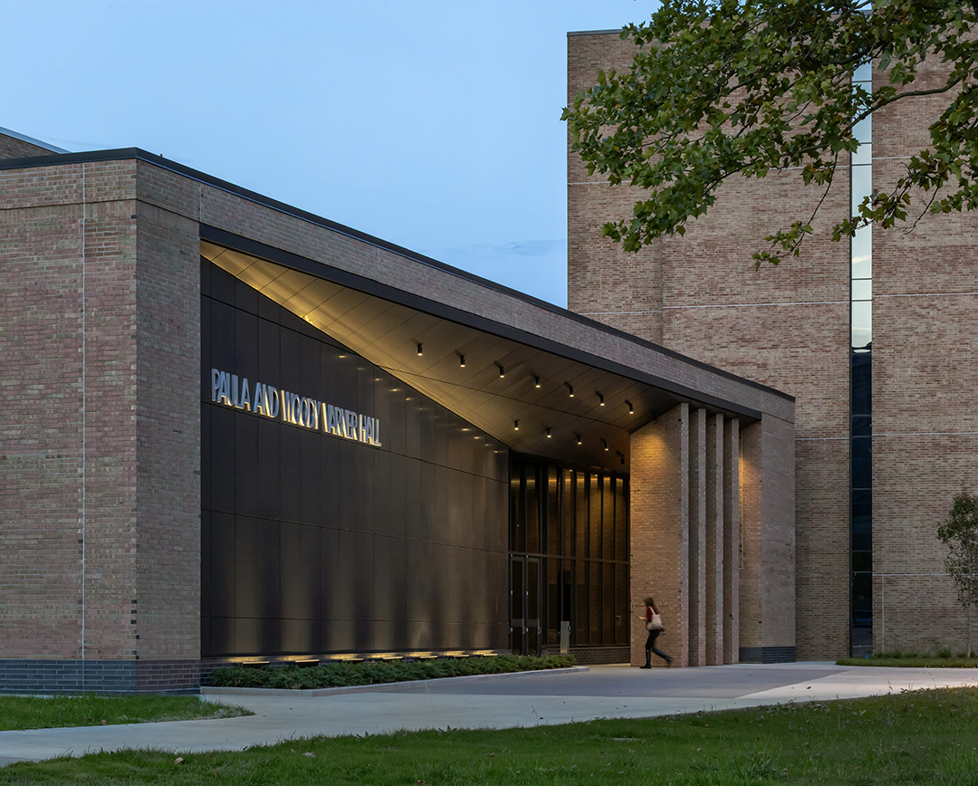
Oakland University Varner Hall Renovation and Addition
Recognizing the need to update an existing 1970’s building, Oakland University embarked on a master plan development for renovations and additions to their music, theater and dance department. With a goal of improving student and public experience while replacing critical—yet unnoticed—building infrastructure, major elements of the master plan included investigation into the HVAC and other building systems. The design team developed options for the University to replace and update these systems within the existing building envelope, as well as creative design interventions, making a significant impact to the functionality and public-facing spaces in the existing facility with a limited budget.
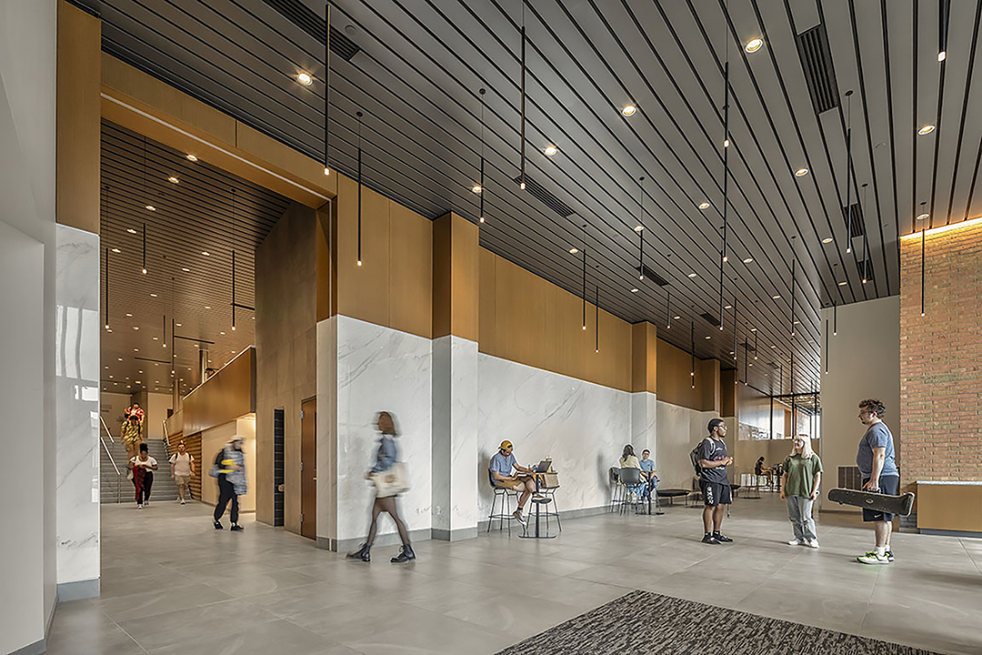
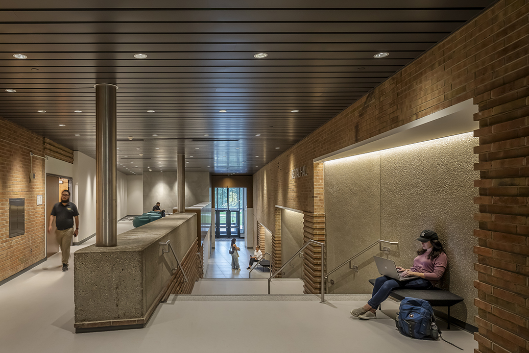
Design solutions included adding new lobbies to help clarify building circulation, address accessibility issues, and create a welcoming front door to the building. Renovations to the existing building’s interior spaces consist of the Band Practice Room, Sewing Lab, Set Design Maker-Space and all circulation and restroom areas, providing a much-needed refresh and unifying the new additions with the older building.
The two 4,500-square-foot additions to the west and south create new elegant entryways to the building. The western addition enhances the entrance to the Recital Hall and creates pre-function and lobby space for students and patrons. The addition to the south increases the Studio Theatre back-of-house area with a renovated Black Box Theater, Reception Lobby and back-of-house spaces.
Design for Integration:
The renovation of Varner Hall was driven by a dual mission: to resolve fundamental circulation challenges within the existing structure and to transform the building into an energy-efficient, long-lasting home for the School of Music, Theatre, and Dance. The original design contained misaligned levels across building sections, resulting in a confusing and inefficient internal circulation system. Simultaneously, the aging infrastructure required significant upgrades to meet contemporary performance expectations. To address these issues holistically, the design team developed a targeted strategy that prioritized major interventions in key areas, while applying more modest updates elsewhere. This approach ensured both functional clarity and spatial harmony, creating a cohesive architectural language that respects the building’s legacy while enhancing user experience. The renovated spaces now offer improved accessibility, visual clarity, and intuitive navigation, fostering a stronger connection between people and place.
Design for Economy:
Economic efficiency was embedded in the design and construction process from the outset. Through a collaborative, integrated approach, the team worked closely with the construction manager and key subcontractors—including mechanical, electrical, and glazing partners—during the design development phase. This early involvement allowed the team to uncover and resolve unforeseen existing conditions before construction began. One example involved the removal of a section of curtain wall, which revealed discrepancies between the original construction and archival drawings. Identifying this during design enabled a cost-effective, real-time design adjustment, avoiding costly delays or changes during construction. These proactive strategies not only conserved project resources but also maximized value within the allocated budget.
Design for Energy:
Energy performance was a critical focus of the renovation. The design preserved and leveraged the embodied carbon in the building’s existing structure while dramatically improving operational efficiency. Key envelope improvements included the replacement of outdated 1960s single-pane glazing with high-performance glass, significantly enhancing thermal performance and occupant comfort. The HVAC system was completely overhauled to meet modern energy standards, and outdated lighting was replaced with LED fixtures throughout. These interventions collectively reduced energy consumption, aligning the project with long-term sustainability goals and supporting a low-carbon future.
Design for Discovery:
The design process was rooted in a comprehensive master plan that outlined a phased vision for the building’s future. From this blueprint, the team identified the interventions with the greatest potential to improve user experience within the constraints of the project budget. Originally composed of three functionally distinct zones—a black box theater, recital hall, and classroom wing—the building lacked internal cohesion. The design’s most impactful contribution was the creation of transitional zones that link these disparate elements. These zones enhance circulation clarity and create intuitive, accessible pathways between levels. This transformation not only improved physical connections but also fostered a more inclusive and welcoming environment for students, faculty, and visitors. The lessons learned from this phased, user-centered approach will continue to inform future campus renovations, promoting adaptability, collaboration, and long-term design excellence.
General Contractor: Granger Construction
Acoustics: Jaffe Holden
Civil Engineering: Spalding DeDecker
Spec Writer: Amy Baker Architect
Landscape Architecture: Grissim Metz Andriese Associates
Photographer: Justin Maconochie
Architectural Honor Awards / Historic Rehabilitation
-
Quinn Evans
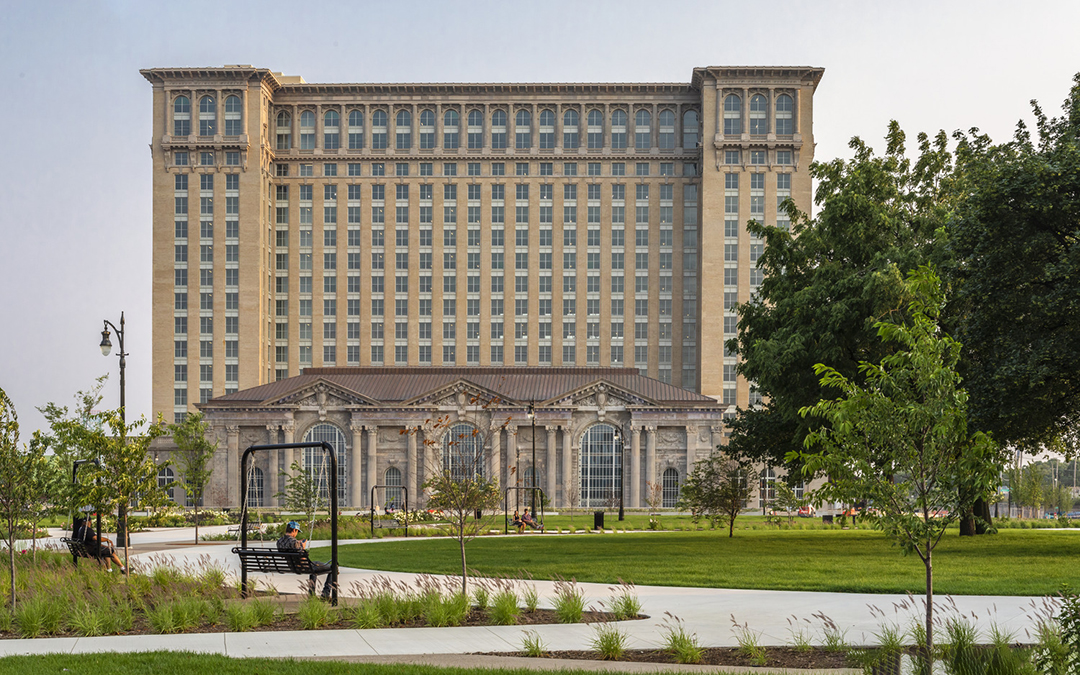
Michigan Central Station
The transformation of Detroit's iconic train station into a mixed-use hub brings new life to an illustrious urban landmark and anchors a visionary, innovative district in the historic Corktown neighborhood.
Among the few surviving grand railroad stations from the early 20th century, Michigan Central Station served for decades as a symbol of Detroit's flourishing industrial heritage. The rehabilitation of the elegant Beaux-Arts building, originally completed in 1913 and once the tallest railway station in the world, is a transformative mix of public spaces and collaborative office settings and will host a range of retail and hospitality functions in Corktown, Detroit's oldest neighborhood. The landmark is the centerpiece of Ford's 1.2 million-square-foot district dedicated to fostering an inclusive, innovation-driven platform to advance sustainable and accessible mobility solutions, bridging human interaction with the digital age, and Detroit's pioneering past with a promising future.
Collaborating closely with the client, construction team, and community, a multidisciplinary team of architects, designers, conservation specialists, architectural historians, and engineers have rehabilitated the monumental structure, including the magnificent Guastavino-vaulted waiting room, historic concourse, and 13-story tower. The contemporary design solutions rooted within the understanding of place and technical preservation knowledge emphasize placemaking and creation of an inclusive environment to encourage collaboration, resourcefulness, reflection, and celebration of the future of Detroit.
Integration. Since 2011, efforts have been underway to revitalize this historic landmark, culminating in a collaborative project that not only restores the station but also integrates it into the fabric of modern Detroit.
Michigan Central Station once embodied Detroit's economic stature, welcoming countless travelers for decades before its eventual abandonment in the 1980s. Now, through community engagement and a deep respect for its heritage, the station has been reimagined. Overcoming decades of neglect, community members rallied to restore the station, recognizing its significance in Detroit's narrative.
Public sessions uncovered the station's profound meaning to Detroiters, informing a design that honors its past while embracing a forward-looking vision. This revitalization connects Detroit's legacy with an innovative future, symbolizing the city's enduring spirit.
While part of an everyday working environment district, careful consideration was taken to give the main ground floor back to the public. Maintaining access from multiple directions, including a connection on the east to the newly rehabilitated Book Depository "Newlab", the historic north entry from Roosevelt Park, and opening up to its southwest community neighbors, all focused on providing an inviting way to experience the various scales of detail and care that went into restoring the building.
Resources. Preserving Michigan Central Station's historic fabric was paramount. Despite widespread deterioration and loss of original materials due to vandalism and environmental exposure, meticulous salvage efforts retained critical architectural elements. From ornamental plaster to limestone columns weighing tons, each piece not only held historical value but embodied energy. Innovative material solutions, such as using lightweight GFRP, balanced preservation with modern construction demands and allowed for a significant retention of the original structure. By retaining the majority of the structural steel, concrete, masonry envelope, and countless other materials, this project, as compared to a new construction, resulted in a 63% reduction in total carbon emissions.
Change. The restoration of Michigan Central Station embodies a shift towards adaptive reuse as climate action. Advanced building systems were artfully integrated into the historic fabric to accommodate diverse uses, promoting efficiency and occupant comfort. Stormwater collection onsite not only reduces strain on city infrastructure but also fosters neighborhood sustainability. Spaces were designed to reflect flexibility for future occupants and activations. This project signifies more than preservation—it's a commitment to environmental stewardship and community resilience.
Discovery. The rehabilitation process of Michigan Central Station was a journey of constant discovery and innovation. From drone assessments to hands-on material evaluations, the team utilized cutting-edge techniques to understand and repair the building. The challenges were immense, including water infiltration, structural compromises, and extreme conditions. Yet, the team persevered, safeguarding the station's integrity while enabling deeper design investigations. Amidst debris, ice, and darkness, they prioritized safety, uncovering architectural treasures and integrating traditional craftsmanship with modern technologies.
Michigan Central Station's transformation epitomizes Detroit's spirit of renewal. Restoring its grand public spaces as vibrant community hubs and supporting Ford's vision for mobility innovation, this project exemplifies how historic preservation can drive sustainable development. By embracing the past while adapting for the future, Michigan Central Station reclaims its role as an icon for Detroit, embodying the city's enduring legacy and promising evolution.
General Contractors: The Christman Company + L.S. Brinker
Structural Engineer: Silman Structural Solutions | TYLin
Mechanical, Electrical, Plumbing Engineer: BuroHappold
Civil Engineer: Giffels Webster Engineers
Fire Protection & Life Safety Engineer: GHD
Conservator: Jablonski Building Conservation
Historic & Exterior Lighting Designer: Gary Steffy Lighting Design
Acoustics Consultant: Jaffe Holden
Security Consultant: Gemellaro Systems Integration (GSI)
Commissioning Consultant: Horizon
Photographers: James Haefner Photography, Justin Maconochie Photography, and Jason Keen
Architectural Honor Awards / Interiors
-
Provoke Design + MGA Architects and Designers
Brushery
Project Overview
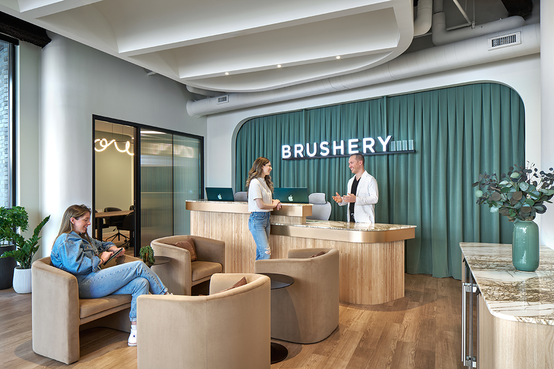
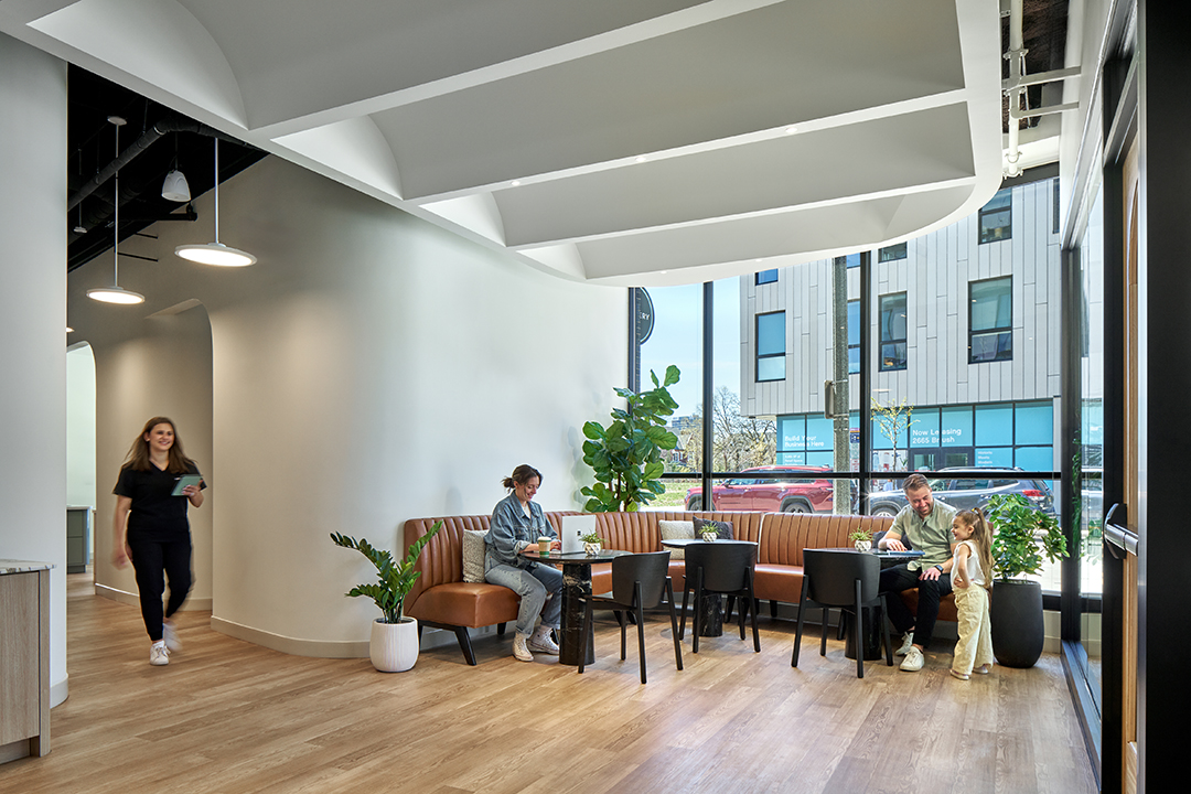
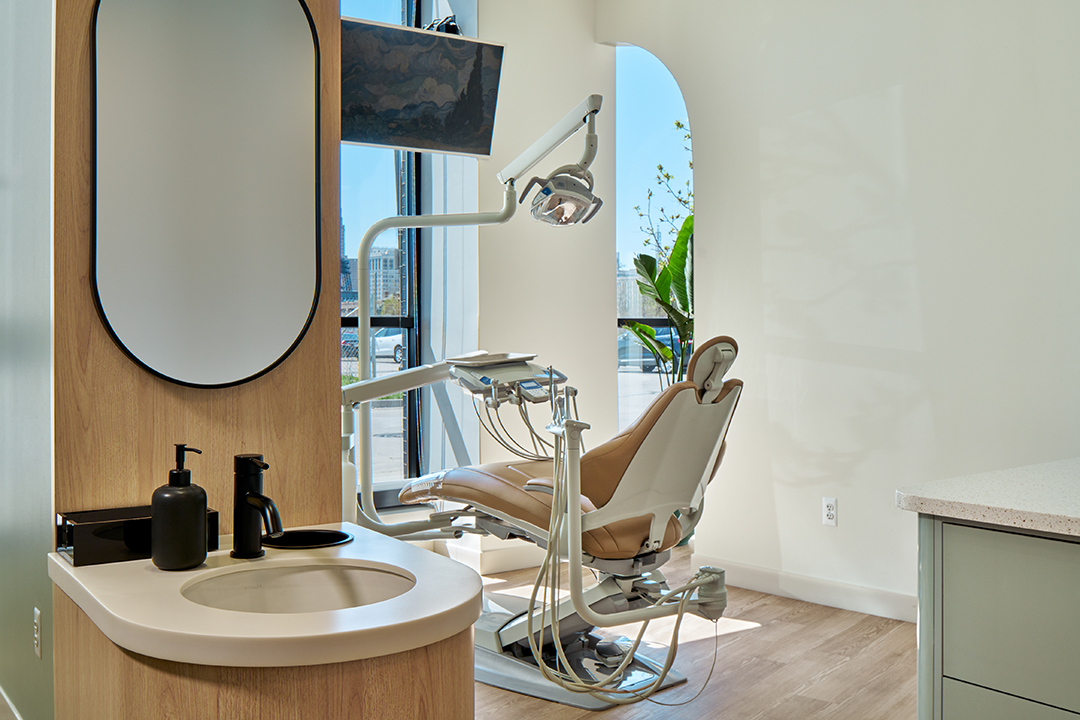
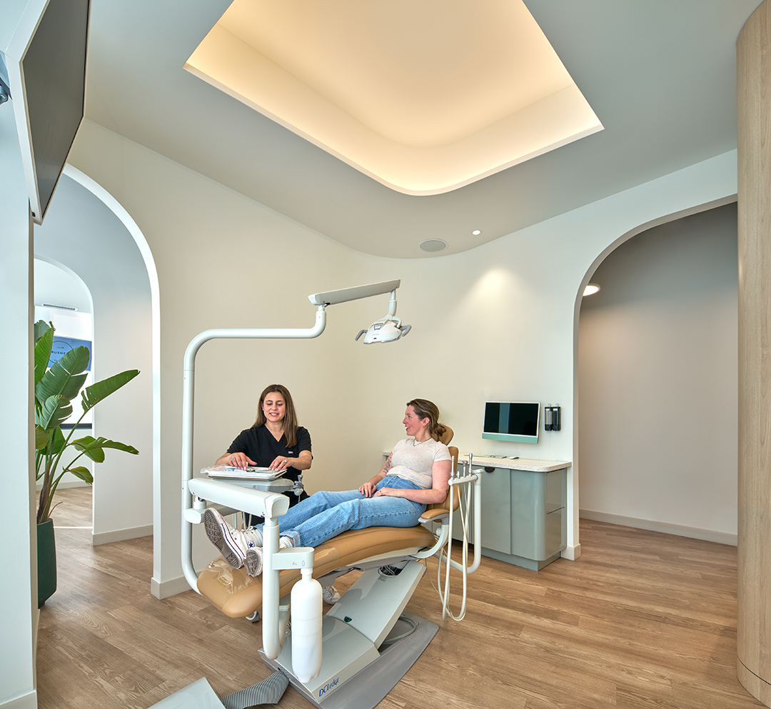
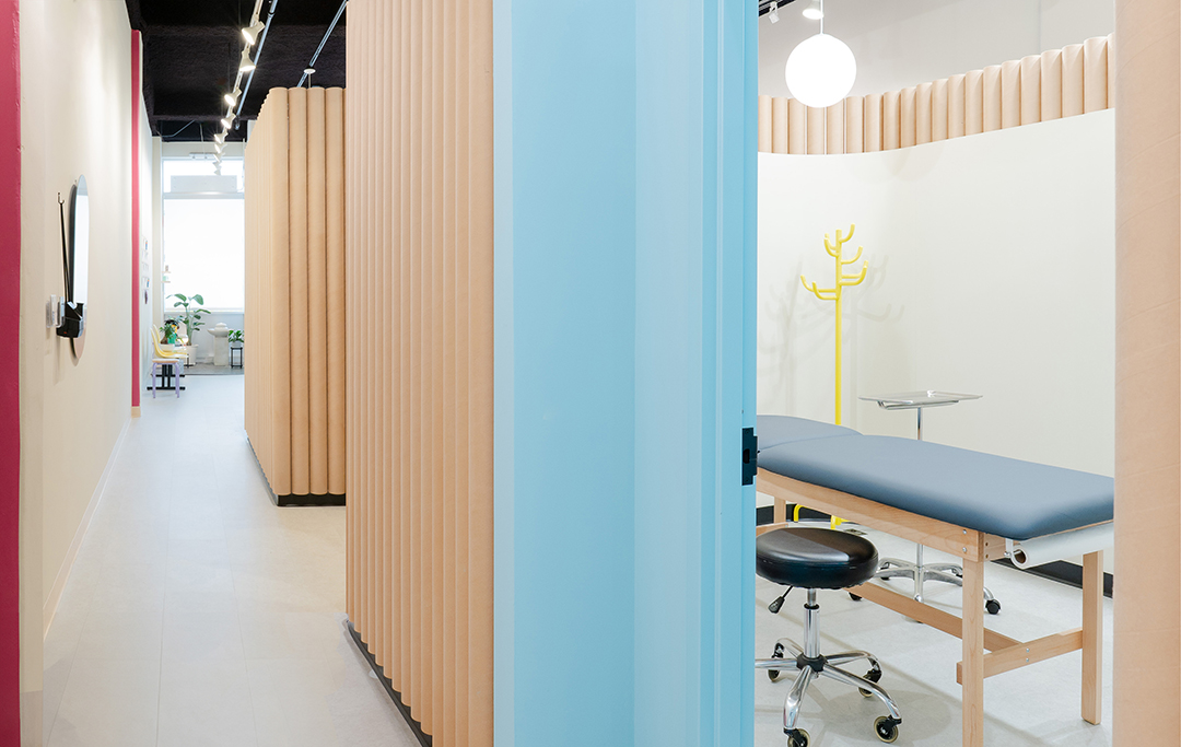
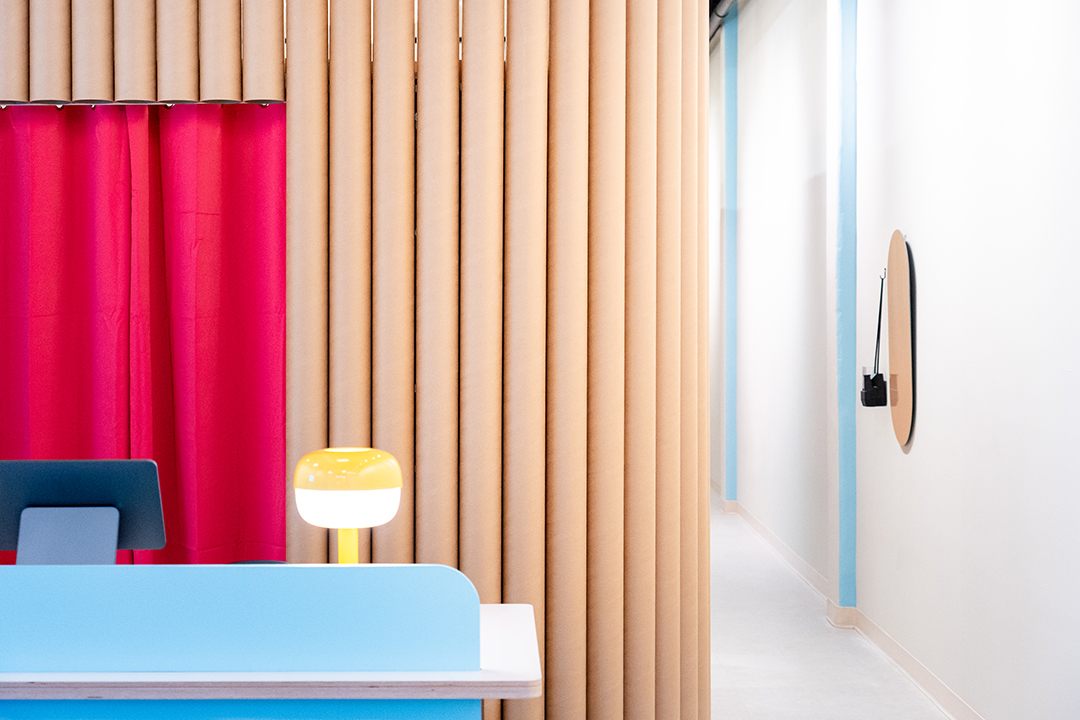
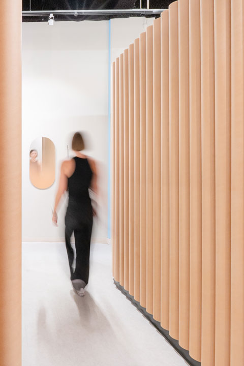
Brushery is a new dental clinic in the heart of Detroit designed to challenge and redefine the traditional dental experience. The client came to us with a radical vision: create a healthcare space that doesn't feel clinical, where anxiety is replaced by comfort, and where design actively supports emotional and physical wellness. The result is a space that feels more like a lounge or wellness studio than a dentist’s office—a warm, curvilinear, sound-conscious environment that invites people in and puts them at ease. Patients don’t just tolerate being here—they come early, stay longer, and even book appointments on the spot.
Design for Equitable Communities
Brushery is a neighborhood anchor, located on a walkable street and designed with transparency and public engagement in mind. Floor-to-ceiling glass at the storefront blurs the boundary between healthcare and community, encouraging passersby to walk in, learn more, and make appointments, eliminating the intimidation often associated with dental offices.
The space is designed for all: wide, navigable paths; intuitive flow; inclusive design features; and a quiet, sensory-considerate environment. Beyond compliance, Brushery fosters a human-scaled, welcoming experience for people of all backgrounds, ages, and physical abilities. It embodies the belief that everyone deserves access to compassionate, high-quality care in an environment that respects their emotional and psychological comfort.
Design for Wellness
Fear of the dentist is widespread—about 36% of people report dental anxiety, and 12% suffer from extreme fear that keeps them from seeking care. Brushery was designed as an antidote to that experience. Every design choice was guided by environmental psychology and patient comfort.
Instead of harsh lighting and sterile finishes, we sculpted a space with soft, organic curves and indirect light. In each exam room, rounded ceiling coves diffuse lighting to eliminate the blinding overhead glare typical of medical spaces. Patients look up into calming forms and soft light, not cold fixtures.
The lobby defies expectations — designed like a boutique co-working space, it encourages early arrival and lingering. Patients use it to relax, work, or decompress, transforming waiting into something restorative. A “relaxation package” further enhances the experience, offering options like hand masks, headphones, neck pillows, and entertainment during treatments.
Sound is another major wellness factor. Medical spaces often amplify anxiety through sharp or mechanical noises. Brushery was acoustically tuned using soft finishes and thoughtful interventions, like the custom fire-rated fabric panel system that covers an awkward electrical panel while also dampening sound. The result is a quiet, serene environment that supports healing, not stress.
Design for Discovery
Designing Brushery taught us how powerful thoughtful architecture can be in shaping human experience. We began by listening—not just to the client, but to data, to patients, and to the emotions typically associated with dental visits. We learned that small, intentional choices—like curving a wall, softening a corner, or concealing a technical necessity with drapery—can transform a space from intimidating to inspiring.
The most surprising discovery was the behavior shift. Patients didn’t just feel less anxious—they embraced the space. They came early. They stayed late. They brought friends. The lobby became a kind of third space, proving that healthcare design can go beyond serving a function to become something community-building and participatory.
The solutions developed — like soft, indirect lighting and layered acoustics—are now influencing our broader approach to wellness spaces. Brushery was never about following templates; it was about rethinking care from the inside out.
Conclusion
Brushery is more than a dental office—it’s a prototype for a better healthcare experience. By prioritizing emotional wellness, environmental design, and community access, we’ve created a place where people feel calm, welcomed, and even joyful. We believe this project offers a compelling case study in how architecture can erase fear, elevate comfort, and connect people more deeply to the care they need.
Architect of Record: MGA Architects and Designers
Design Architect: Provoke Design
General Contractor: PCI-Dailey Company
Mechanical & Plumbing Engineer: Design-Build w/ Bumbler Mechanical
Electrical Engineer: ETS Engineering
Photographer: Owen Kaufman -
SYNECDOCHE
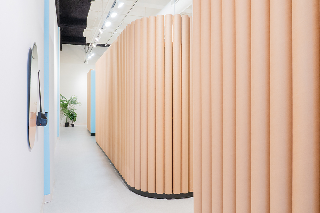
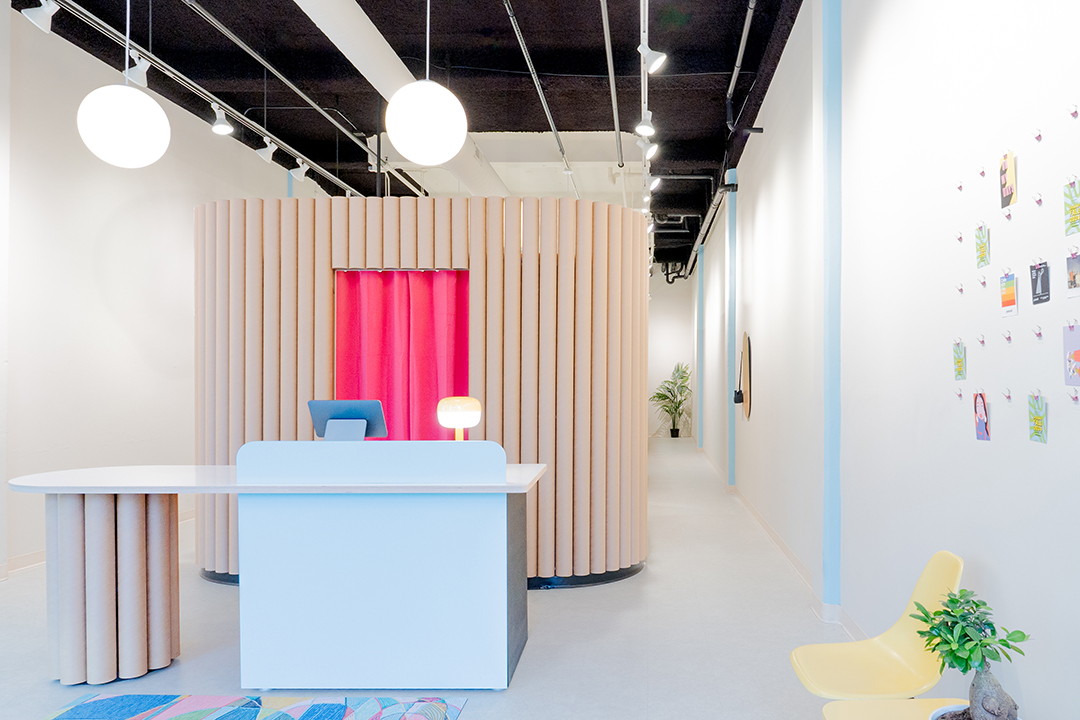
Gamma Piercing MKE
When piercing artists returned to their hometown of Milwaukee, Wisconsin, they didn’t want to leave behind their Ann Arbor studio culture and design. The couple and owner, contacted the architects to design the second piercing studio following a successful first location.
The interior architecture connects the piercing experience with personal ritual within its 1,100-square-foot retail space. Each piercing becomes part of a unique narrative of self-care and expression, while the space itself defines a ritualistic journey, offering opportunities to document and celebrate personal moments.
Stripped of unnecessary stimuli, a natural tan base palette with color accents signals interaction points along the journey for intuitive navigation while reducing guest anxiety. Before entering the space, guests are welcomed to the experience through friendly environmental graphics affixed to the front door. The reception and retail give space to set intentions, encouraging guests to browse and select jewelry at their own pace without the facilitation associated with traditional jewelry counters. Plants and a water feature add a layer of tranquility to foster a calming atmosphere. Piercing rooms are located towards the back of the space, providing visual and acoustic privacy so guests can be fully present and share concerns with their piercer. Gamma’s ritual ethos is further highlighted by graphic prompts on mirrors outside piercing rooms, allowing guests to reflect on their new look in a supportive and secluded setting. Guests may use the vintage Polaroid camera provided to document and share their piercings in the retail gallery.
Recognizing that retail often refreshes in shorter cycles than a full building lifespan, the design team prioritized incorporating materials that could be disassembled and recycled. Paper tubes are not a new architectural concept: examples of paper tubes used for aesthetic applications and small fixtures exist in interior precedent. When used in a wall application, they are typically attached to existing drywall or connected to the floor and ceiling. Gamma MKE utilizes the tubes in a freestanding wall partition, which has the additional benefit of stopping below the ceiling to avoid relocation of existing fire suppression, track lighting, and mechanical systems.
A fabrication shop is integrated into the architecture studio for full-scale prototyping and production. Our studio built a series of wall mockups to resolve fabrication techniques, assembly sequence, and material durability, including flame spread. Structural consultants calculated and confirmed lateral load compliance by adding steel post supports to the prefabricated wall panels. Intensive coordination between the design team in Michigan and on-site contractors in Wisconsin was required to manage the placement and tolerances of the support steel posts. This process ensured a successful 24-hour installation by the design team.
The prefab design using novel materials adds to the catalog of possible applications for paper tubes in architecture. It showcases how a light intervention ensures that the design maximizes its effect within the client's budget without a complete renovation. For a small project, it addresses the big picture of sustainable design goals by connecting responsible efforts to delightful experiences.
Design for Wellness:
Early in the project, the design priorities established the ritual for piercing for the client that set the tone of the space and how guests are treated from entering the space through leaving with a new piercing. Water features and live plants, along with natural light, are abundant throughout the space to balance the white noise and ambient nature with self-expression.
Economy:
The space was a former retail shop with existing HVAC, fire suppression, and lighting. A major factor of the project was based on being able to re-use the existing infrastructure to allow for the budget to be spent directly on the spaces the staff and guests use. The walls of the rooms do not reach the ceiling, so that no adjustments were required of the system's coverage and distribution within the space.
Resources:
Retail shops rarely last beyond 10-15 years, and building materials typically end up in landfills during renovation updates. The effort was made to build the walls of the space with as much bio-based and recycled material as possible to reduce the impact on landfills at the beginning and end of the project lifecycle. Recycled paper tubes make up the structure and finish of the walls for the three rooms of the space. Plywood is used as the binder to build the wall panels, and all of the panels were pre-fabricated off-site. The precision of prefabrication reduced the coordination time and material waste on site, which was already a small space and budget to work within.
General Contractor: Duffek Construction
Structural Engineer: Silman/TYLin Structural
Architectural Honor Awards / Single-Family Residential
-
Houm + Three Squared Inc.
Cochrane Home
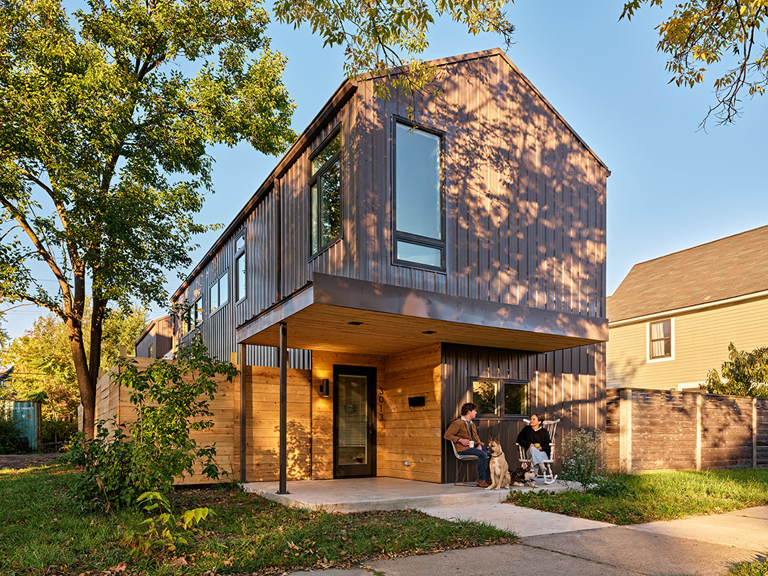
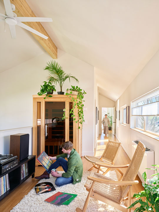
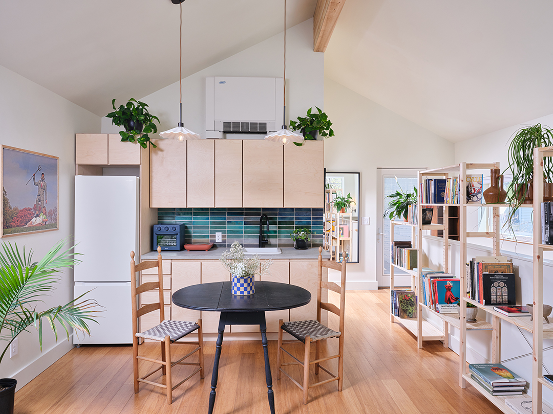
The Cochrane Home stands as a prototype for a smarter, more efficient future of housing — one that is better designed, sustainable, and more attainable. Nestled on a narrow 30-foot-wide infill lot in Detroit’s North Corktown neighborhood, the project transforms a challenging site into a vibrant, adaptable, and resilient urban home. Developed through a computational, iterative design process, the project maximizes performance, affordability, and community integration, setting a new benchmark for urban infill housing.
At 1,600 square feet, the main residence includes three bedrooms, two bathrooms, and a soaring 24-foot-tall cathedral ceiling that fills the living area with light and openness. A bridge connects the main home to a 430 square-foot accessory dwelling unit (ADU) above a single-car garage, offering a flexible secondary space for guests, work, or rental income. Every aspect of the design — from its footprint and solar orientation to its service cores and material palette — was informed by performance modeling to achieve the greatest social, environmental, and economic outcomes with the least resource input.
Design for Equitable Communities:
The Cochrane Home strengthens Detroit’s urban fabric by offering a housing model that is compact, flexible, inclusive, and tailored to its unique site and context. The ADU, accessed from an alleyway, provides an additional unit of housing — a critical need in a neighborhood facing rising housing costs and limited supply — without disrupting the character of the community. The walkable scale, welcoming patio spaces, and thoughtful massing promote human-scaled, community-oriented living. In a city where equitable development is a central concern, this project supports new paths for ownership and housing diversity within an evolving urban landscape — and does so at an accessible price point.
Design for Economy:
Every square foot of the home was designed to work harder. The layout maximizes spatial efficiency, increases passive solar gains, and transforms a narrow 16-foot-wide footprint into a light-filled, functional space well-suited to urban living. The digitally fabricated service core consolidates all plumbing, mechanical, and utility functions, enabling streamlined construction and reducing waste and complexity. Off-site fabrication of key components reduced construction time by 30% and helped bring the total project cost to $211 per square foot — approximately 40% below the regional average for new construction. This demonstrates that high-quality, thoughtful design can still be delivered affordably, expanding access to beautiful and well-performing homes.
Design for Energy:
Energy performance was central to the design approach. High-performance, operable windows were placed using solar and climate analysis to reduce undesirable heat gain and promote passive daylighting, heating, and ventilation. The building envelope includes R-40 walls and an R-60 roof, using a fully integrated, continuous, and 100% recyclable insulation system that virtually eliminates thermal bridging and air infiltration. In-floor radiant heating is paired with an electric air-to-water chiller for cooling. As a result, the home is projected to use 83% less energy than regional averages for homes of similar size — setting a new benchmark for residential energy efficiency in its region.
Design for Resources:
Durable, low-impact materials were selected to reduce environmental impact while maintaining long-term value and integrity. Exposed concrete floors and countertops eliminate the need for surface treatments. Reclaimed tile was used in bathrooms and backsplashes, and bamboo — a rapidly renewable material — was chosen for stair treads and second-floor flooring. Exterior cladding includes recycled-content metal siding rated for a 40-year life span, paired with naturally weathering cedar accents. Throughout construction, digital fabrication and precise material ordering enabled a 33% reduction in waste — eliminating the need for a dumpster on-site. These efficiencies reinforce the project’s commitment to sustainability and smart material use.
Design for Change:
Flexibility is embedded in the project’s DNA. The accessory dwelling unit is fully self-contained and accessible via the alley, enabling a wide range of future uses — from guest quarters and home offices to rental income opportunities or family expansion. The open-plan living areas, streamlined service zones, and high-performance envelope allow for interior reconfiguration without major structural modifications. By planning for adaptability from the start, the Cochrane Home is built to serve generations of residents with evolving needs.
Conclusion
In a time of widespread housing insecurity, rising costs, and climate pressure, the Cochrane Home demonstrates a new path forward. Through rigorous design, fabrication, and sustainability practices, it delivers a high-performing, human-centered home at a cost that reflects real-world constraints. This project proves that better housing — more equitable, efficient, and beautiful — is not a distant goal, but an attainable reality now.
Architect of Record: Three Squared Inc.
Design Architect: Houm
General Contractor: Living Edge
Structural Engineering: Runkle Consulting
Panel Engineering and Manufacturing: Guardian Structural Technologies
Photographer: Jason Keen
Architectural Honor Awards / Small Project
-
SmithGroup
Boyne Gatlinburg Skylift Lower Building
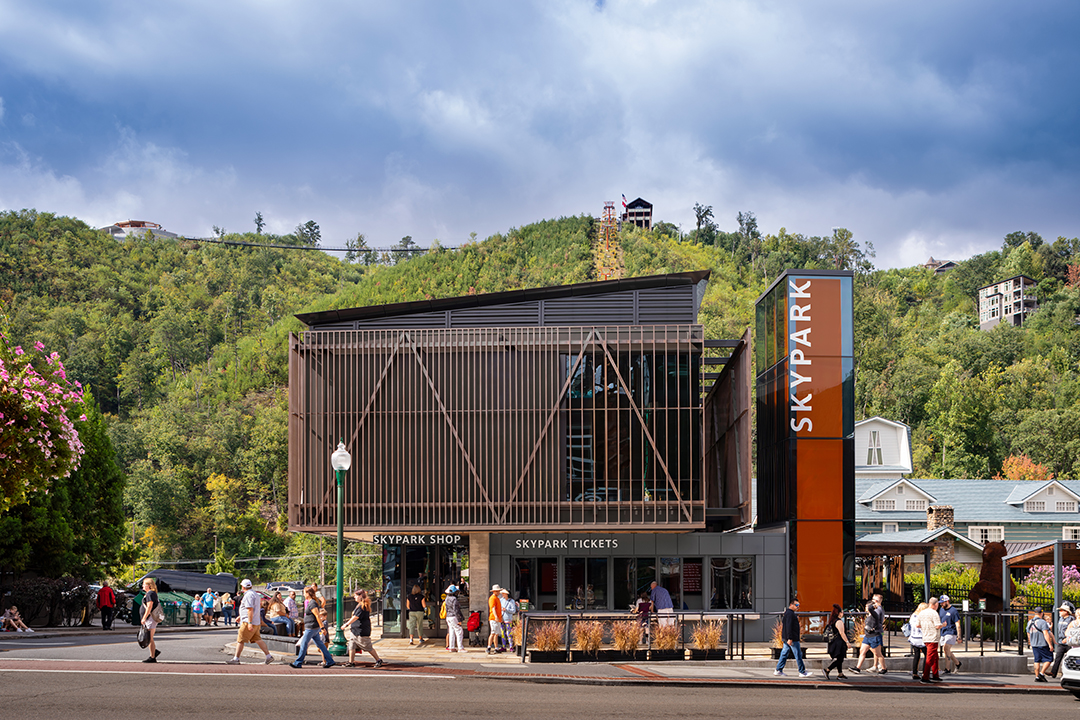
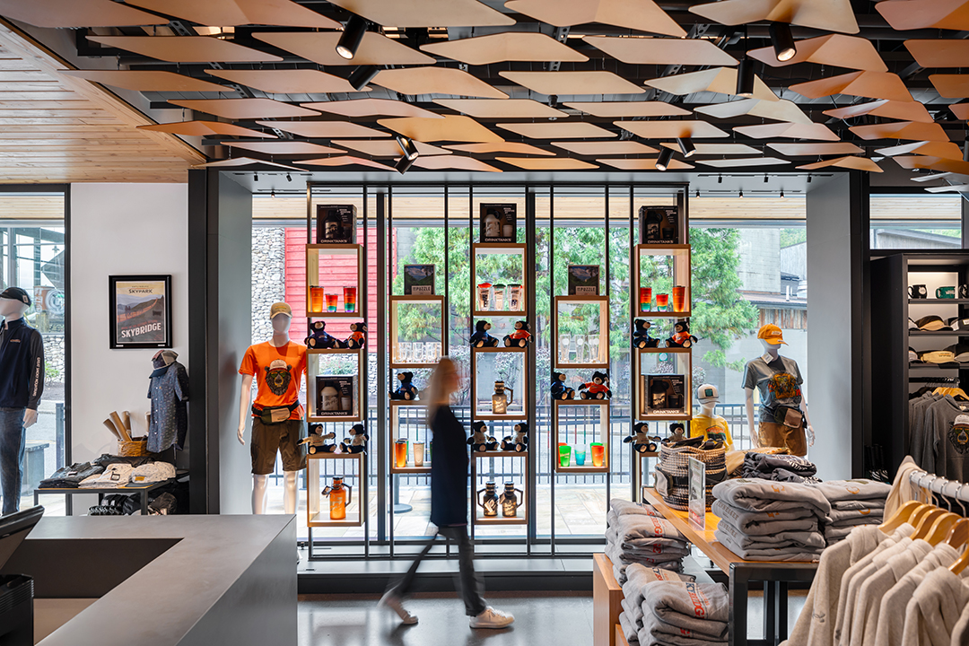
Gatlinburg is a tourist destination, drawing people from all over to enjoy the grand vistas and natural beauty of the Great Smoky Mountains. Ironically, the city also caters to a kitschy aesthetic that either sways toward a Disneyesque extreme or a romanticized perception of an Appalachian architecture. In this context, Boyne has carved out a unique and contrasting experiential niche—a simple but moving journey up the mountain in an open chair lift that terminates at the longest pedestrian suspension bridge in North America.
The new two-story, 5,000sf base building is the gateway to this experience and houses administrative offices, retail, and ticketing. Queuing for the lift is also funneled through a new storytelling courtyard and interior passageway that feature the history of the surrounding mountains and legacy of this family-run business that has grown up alongside them.
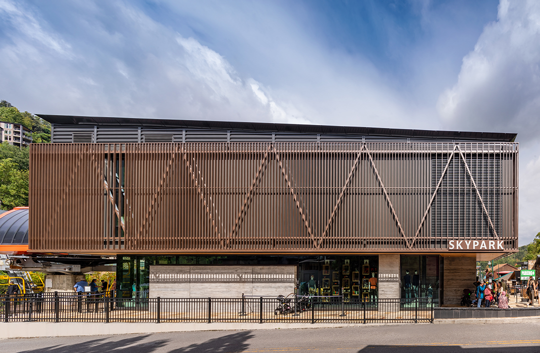
The building’s design embodies similar characteristics of the bridge and stands prominent among its neighbors through its boldly expressed structure and geometric purity, which is bent only to suit function or site. The skin consists of a metal treillage a top a board-formed concrete base and pairs with a backlit tower—a beacon for the masses along Parkway.
Design for Integration – The building has been reimagined to offer visitors an immersive experience through innovative site and building design. Drawing inspiration from the site’s iconic suspension bridge and elegant image of the SkyPark, the architectural expression aims to counter the kitschy vernacular of Gatlinburg. Visitors are surrounded by curated elements that enhance their connection to nature and material articulation of the area, creating a memorable and sophisticated experience.
Design for Equitable Communities – Located in an urban area, the building draws visitors from both pedestrian and vehicular pathways. The expansion of the queuing area has been thoughtfully crafted to prioritize the visitor experience by minimizing disruptions to traffic and ensuring smooth circulation flow from the street. The accessible design welcomes diverse guests to the SkyPark adventure and offers a respite space for those waiting. An exterior canopy offers shade and water misters, while an interior zone provides conditioning before guests ascend the mountain on the infamous chair lift. Storytelling features offer opportunities for engagement and discovery.
Design for Ecology – The project’s location at the foot of the Great Smoky Mountains drove many design considerations for site, building, and operations. Native plantings are used throughout the property to support local biodiversity and create a natural, inviting landscape. Minimizing disruption to the surrounding site was carefully coordinated during construction and informed material system selections. Resilient materials, such as concrete and metal, are utilized to reduce maintenance needs and ensure long-term durability. Vertical fins are incorporated across the second-story glass facade to deter bird collisions.
Sensitivity to human comfort was also prioritized. Time-clock controls are implemented to automatically turn off uplighting after curfew, preventing light pollution and preserving the natural night environment. HDR imaging analysis was performed to design brightness based on the context. Shielded light sources are integrated into the facade to control spill of light and glare on adjacent properties. Within the interior, mechanical equipment is strategically located within a separated interior space to minimize noise near occupied areas and enhance the comfort of occupants.
Design for Economy – Optimizing buildable area and functionality for the owner, the building footprint is maximized on the site through a two-story design and landscape expansion. Guest-centric and staff spaces are separated, and programming is expanded to include retail and an interior queuing path. Both amenities require opaque perimeter partitions and open, flexible planning to offer future flexibility as their offerings evolve. Durable materials extend the building’s life span, while daylight harvesting, occupant sensors, and LED lighting fixtures are integrated to reduce electrical lighting loads, ensuring energy is used efficiently.
Design for Wellness – The design emphasizes a strong connection to nature through thoughtful site enhancements and biophilic elements within the interior. Staff spaces are designed to provide access to daylight and views, enhancing the overall work environment. Workspaces are oriented to the north for ideal diffuse light and glare minimization. Thermal comfort is prioritized through advanced controls, and indoor air quality is maintained at high standards. The selection of materials focuses on low-VOC options. A centrally located stair is designed to encourage staff and guests to use it over the elevator, promoting physical activity and interaction.
General Contractor: Merit Construction
Photographer: James Ewing